You are here: Communications Portal > Download Gulliver Logos
Download Gulliver Logos
Only logos supplied by Marketing and Communications should be used. If you have seen an alternate logo you would like to use, please reach out to a member of the Marketing and Communications Team or email us at communications@gulliverprep.org.
Please take a moment to review our branding guidelines to ensure proper logo usage on materials. General usage guidelines are below.
Gulliver Prep
This is the primary logo. It is recommended that it be used on white or very light backgrounds only for best readability. The two colors in the logo are PMS 540 (dark blue) and PMS 285 (sky blue) and the logo should be printed as such.
One color logos should be used sparingly. It is recommended that these be used on white or very light backgrounds only for best readability.
Reversed versions of the logos should only be used on continuous tone backgrounds of 60% black or darker. Use best discretion for readability when using reversed logos, especially over photography.
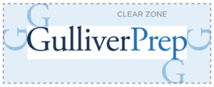
Clear Space Rule
The clear zone is an area designated around a logo in which other elements should not encroach. It is suggested to be the height of the “G” in the logo on all sides. This is a suggested minimum and more space is always better.
Raider Spirit G
The Raider Spirit “G” is to be used primarily in relation to sporting materials, publications, events, apparel, social media outlets, etc.
When printing in color, the Raider Spirit “G” should be in blue ink (PMS 540).
The Raider Spirit “G” may appear in gray ink (Cool Gray 9) as an alternative.
The Raider Spirit “G” can also be used in white when reversed out of a solid background.
Clear Space Rule
A clearance of .5x the “G” must always surround the Raider Spirit “G”. Text wrapping may be used as long as there is sufficient clearance around the symbol.
